Imagination Series: Rasmus Grønfeldt Winther
 Rasmus Grønfeldt Winther is Professor of Humanities at the University of California, Santa Cruz. He is a philosopher of science, researcher, writer, educator, diver, and explorer. He works in the philosophy of science and philosophy of biology and has interests in epistemology and political philosophy, cartography and GIS, and science in general. Recent publications include “A Beginner’s Guide to the New Population Genomics of Homo sapiens: Origins, Race, and Medicine” in The Harvard Review of Philosophy; “Mapping the Deep Blue Oceans” in The Philosophy of GIS; When Maps Become the World (2020); and Our Genes: A Philosophical Perspective on Human Evolutionary Genomics (2022). Winther’s contribution to our 2022 Imagination Series invites us to think about maps more capaciously as powerful imaginative instruments that can challenge the status quo, reconfigure spatial divides, and help us chart new worlds.
Imaginative Maps
Introduction: Reimagining the Status Quo
My first cartographic love was a small globe fixed to a wooden pedestal, which sat on the desk in my childhood room in Caracas, Venezuela. I spent hours rotating that globe, turning it “upside down,” imagining my possible destinations. In that little room, surrounded by two aquaria, dozens of tropical plants, and five turtles, I traveled around the world, studying the Linea del Cambio de Fecha (International Data Line), Ecuador (Equator), and Eclíptica (Ecliptic) inscribed on my “Atlas” globe. I learned the names of what, to my child’s mind, were exotic places. I dreamt of traveling the world, but I always found myself back on the Caribbean islands and the islands of Oceania, considering oceanic possibilities.
Over the years, my passion for the ocean grew, and so did my cartographic passions. The two found simultaneous expression in the two Indian Ocean Floor (1964, 1967) maps by Marie Tharp and associates (Figs. 1 and 2), the latter one of which I remember seeing as a teenager in an old National Geographic. Although I was no longer a child, I was still captivated by the beauty and creativity expressed by Tharp. Not incidentally, I felt the same kind of sheer excitement and awestruck wonder when, much later in life, I stumbled upon Pablo Carlos Budassi’s Observable Universe Logarithmic Map (Fig. 3) and Ursula Le Guin’s Earthsea Map (Fig. 5). Maps, it seems, have long beguiled me.
Tharp’s maps are gorgeous, but they are also accurate and faithful representations. Indeed, all cartographers strive for accuracy, and their maps are evidence of their efforts to be honest about the world. Their attempts at fidelity make cartographers essentially conservative. In fact, through technical prowess, mapping represents and furthers the status quo. That which is mapped, is – and that which is, can be mapped.
“For instance, if maps also capture something different than what is there, can they be used imaginatively? Can mapping help draw, picture, and imagine the new, the unexpected?”
And yet. While maps may be partially true, they cannot ever be “real.” By simplifying, selecting, and symbolizing the real—by abstracting and generalizing from what exists—cartographers depict what is already “there” through necessary distortion and idealization. Maps thus invite a number of questions with respect to imagination. For instance, if maps also capture something different than what is there, can they be used imaginatively? Can mapping help draw, picture, and imagine the new, the unexpected? Could maps, in fact, undermine the necessarily conservative bias of their makers to offer readers and users something of the anti-status quo? Can cartographic reason re-create our world? Can it bring forth new worlds?
I believe that precisely because maps capture, from a particular perspective, what exists—or at least what is taken to exist—they offer not only an illustration but a proving ground for the tension between representations of the status quo and representations of imagination. This tension is dialectical, in that both “sides” are valid and true, capturing important, deep aspects of the whole (which is, in this case, existence, or our lived experience). In a dialectical distinction, richness emerges by accepting interpenetration or synthesis between two seemingly contradictory claims or theses. Contradiction is not antagonistic but complementary. Maps, by depicting and mediating just this reciprocation, invite us to question, to rethink, and to ultimately reshape the world.
These questions regarding imaginative maps provoke an engagement that is not so different from my childhood experience with my globe—we can marvel at geographical details while simultaneously exploring imaginative possibilities. Such synthesis encourages us to proceed from the nexus of science and art to reimagine the world, according to (at least) three lines of inquiry (explored further in my book When Maps Become the World): (1) by questioning our assumptions about the current world, (2) by inviting new perceptions from new perspectives, and (3) by experimenting with new possibilities by which we can recreate and reshape the world.
I welcome you to reflect on the conservative-creative map at the borderlands of science and art. Inspired by a few mapping projects, including Tharp’s ocean floors, Budassi’s universe, and Le Guin’s Earthsea, we will engage in the iterative processes of imagining and reimagining that foster creative syntheses. To my mind, these projects not only provocatively illustrate the intersection between the status quo and imagination, they also evoke the future possibilities on which our vulnerable world may depend.
Tharp’s Ocean Floors
By articulating a relatable and artistic vision of the wild—even ethereal—landscapes of ocean floors, Marie Tharp’s maps capture the status quo while also inviting imaginative collaboration. In fact, these maps were born out of Tharp’s unique collaboration with a scientist and lifelong partner, Bruce Heezen, and an artist, Heinrich Berann. Heezen and Tharp had access to significant sounding data taken by ships of various nationalities between the world wars and during the Cold War. The vessels crossed various seas and oceans, especially the Atlantic, but also the Pacific, Indian, Mediterranean, and Antarctic. While the fuller shape of the story can be found elsewhere (e.g., Tharp 1997, 1999; Felt 2012; Winther 2019), here Tharp’s own words from an oral interview help us understand the interplay between the world’s truth and the imagined new:
[National Geographic] had, in their files, a letter from a little girl who said, “I’ve been looking at your maps, and my father can paint better than you can.” And so the Geographic sent [ca. 1957] their chief cartographer, [Albert] Bumstead, over to meet this man, because the Geographic was very sensitive to letters from children. They sent Bumstead over there to case the joint, and he found this fabulous man, Heinrich Berann, living in his home outside of Innsbruck, Austria. … He had a beautiful home and a separate studio … But he couldn’t make any money with his serious paintings, you know, in the style of [Leonardo] Da Vinci. So he took up doing mountains for the Austrian ski tourist trade where they would pay him to draw the mountains with every trail, hostel, tree, rock, whatever. And he’d paint these, and the Austrian Tourist Bureau bought them and sold them to the Austrian ski resorts. And so that’s how he made his fortune was with those, rather than his serious work. But since he lived in the Alps and knew how to paint so well, the National Geographic hired him, and he was such a wonderful man. We worked with him for ten years. We just loved him. A very great artist. … First we did the Indian Ocean with him. And he would copy our, my sketch map. And you can compare the two. Because I think I gave you both of them. Mine’s real big [Fig. 1] and the ones in the National Geographic are about that big [Fig. 2]. They had a captive audience. (Tharp 1997)
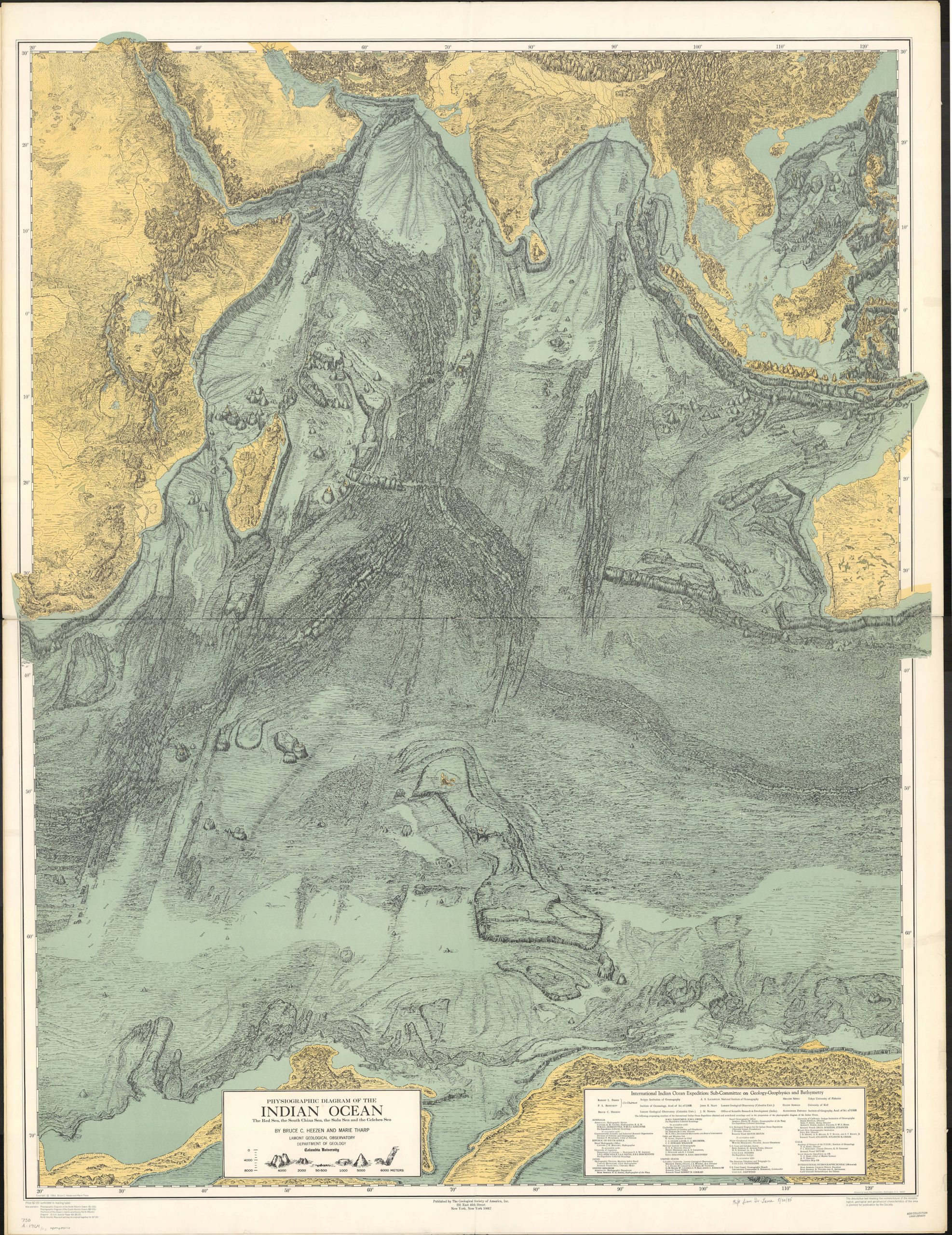
Fig 1. Physiographic diagram of the Indian Ocean, the Red Sea, the South China Sea, the Sulu Sea and the Celebes Sea
Created by Bruce C. Heezen and Marie Tharp (1964). Physiographic diagrams such as this one—as well as Tharp and Heezen’s perhaps more classic physiographic diagram of the Atlantic Ocean (map inset to Ewing, Heezen, and Tharp 1959)—provide a “45-degree view” as if floating at an angle above Earth, and drawn with stylized shading and iconography. Credit: Physiographic diagram of the Indian Ocean, the Red Sea, the South China Sea, the Sulu Sea and the Celebes Sea by Bruce C. Heezen and Marie Tharp, 1964. From the American Geographical Society Library, University of Wisconsin-Milwaukee Libraries.
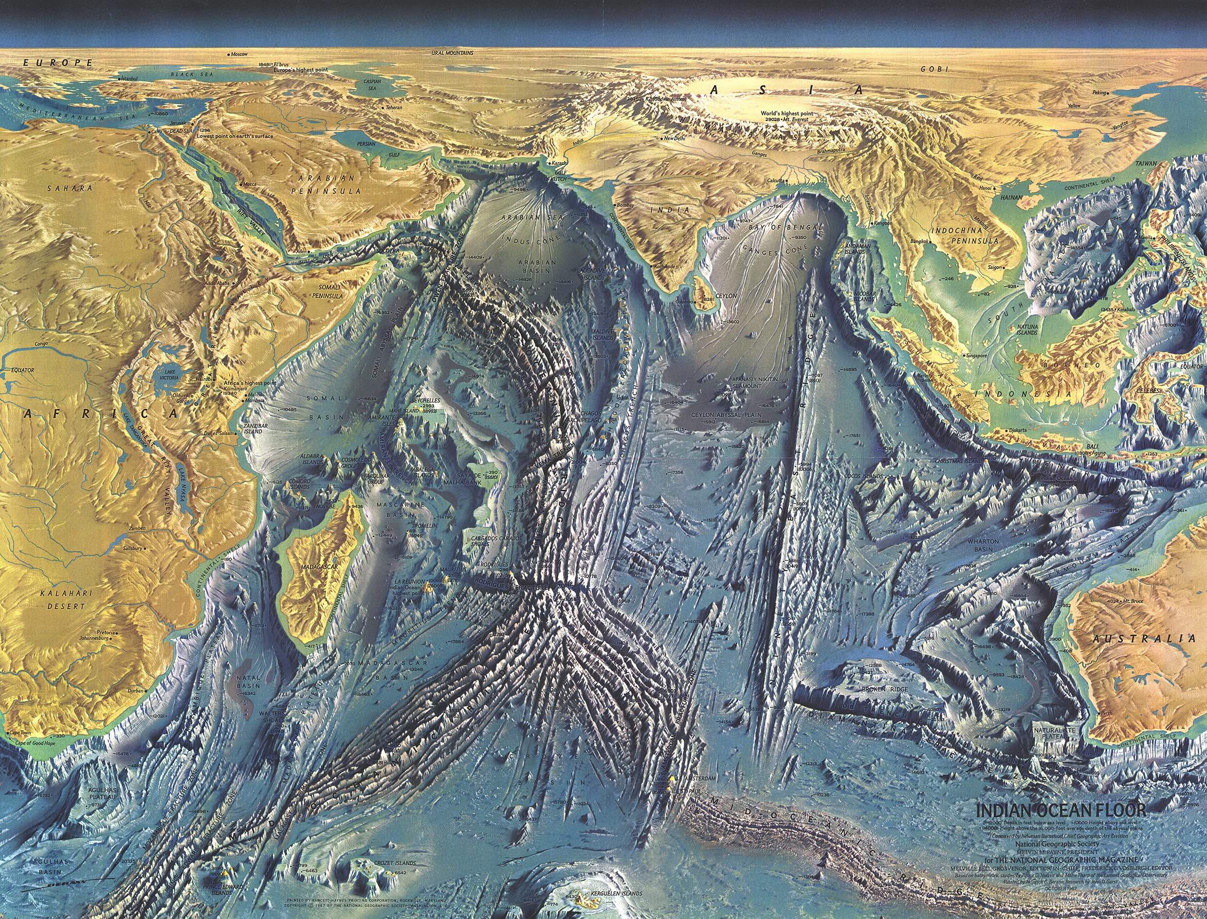
Fig 2. Indian Ocean Floor
Berann, Tharp, and Heezan’s Indian Ocean Floor panorama map lived as a supplemental, foldout map in the October 1967 issue of National Geographic. Subscriptions numbered six million in the USA alone (Felt 2012, Loc 2810). This map unfurled an interpolated and extrapolated ocean bottom in a provocative perspective, with the lowest (the Dead Sea) and highest elevation (Mt. Everest) land points on Earth also explicitly depicted. Credit: Indian Ocean Floor by Bruce C. Heezen, Marie Tharp, and Heinrich Berann, 1967. From Heinrich Berann/National Geographic Creative. National Geographic Image Collection.
Budassi’s Universe
If Tharp situates abstraction as necessary to a map’s content and structure, then Pablo Carlos Budassi makes abstraction necessary to cartographic communication. Budassi is a contemporary artist, who cartographically depicts the universe in impressive, inspiring, and haunting ways. In an autobiographical essay he prepared for a “Latin American Art” module of a History of Consciousness course I taught on “Latin American Thought” (HISC 136), Budassi wrote:
Beauty in complexity is a concept that I try to convey in my works. To convey this concept, I had to make some abstractions. If you look at the night sky in the best possible conditions you will only get to see a lot of beige dots and maybe some light clouds and some dark ones obscuring parts of the first ones. It’s a very pretty sight but there doesn’t seem to be as much complexity as there really is.
What I wanted to show with these artworks [e.g., Fig. 3] is how amazing the universe is wherever you look at it. It doesn’t matter what scale you look at: planets, star systems, nebulae, galaxies, or large galaxy formations, everywhere you look you will see beauty, complexity, and fun!
It is so diverse, that it even has a “boring” element: on a large scale, as seen at its full length, the cosmic web looks like a sponge, a fairly smooth grainy texture without bumps or gaps. (Budassi 2022)
I have been fortunate to work with Budassi: We are currently developing a Vulnerable Oceans infographic, and in 2020, we worked on Nature Timespiral (Fig. 4), showcased by Sara Barnes, staff editor at My Modern Met (Barnes 2021). Together, Budassi and I try to locate and enliven the tension inherent to mapmaking. Pencil in hand, Budassi first draws a draft sketch; “‘[t]hen, it’s a week or two of research and discussion with my friend and teacher professor Rasmus Grønfeldt Winther,’ he explains, ‘and then I assemble the final graphic as a collage of public domain textures and some original photos and illustrations’” (Barnes 2021).
Budassi abstracts Tharp’s project in retrospectively imaginative ways. Like her, he also distorts space itself, and exaggerates the magnitudes and relative locations of represented objects (submarine mountains, or planets and stars). But Budassi goes a step further with what he calls “a realistic photography style… that tries to condense as many details and data as possible.” (Barnes 2021, emphasis added). As illustrated by Figures 3 and 4, this style overwhelms the viewer, forcing new visual paradigms that can accommodate Budassi’s crowded vision. Yet, his realistic photography cannot help but invite an increased empathy with the world of his creation.
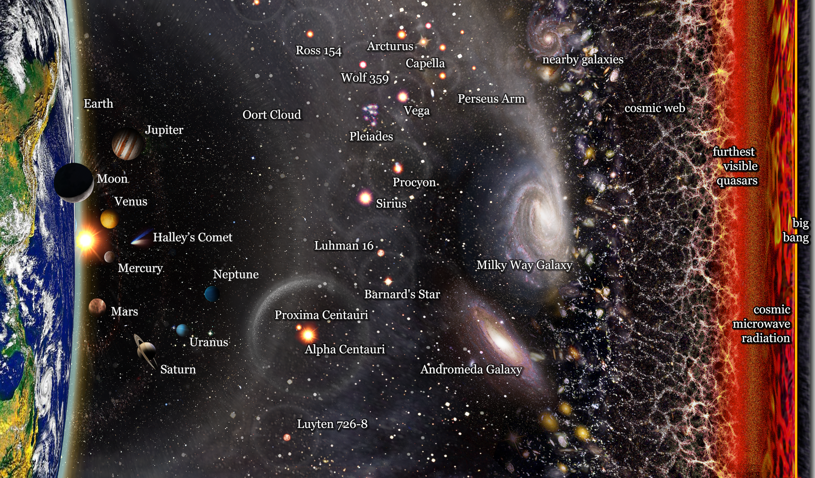
Fig. 3. Observable Universe Logarithmic Map
Marvelous celestial bodies ordered from left to right according to their approximate distance from Earth. Planets of the Solar System, stars, galaxies, the cosmic web, and the Cosmic Microwave Background radiation are represented. Astronomical individuals are enlarged for clarity and to illustrate their shape. This highly abstracted distance-from-Earth map is logarithmic (base-10) along the x-axis. Credit: Observable Universe Logarithmic Map by Pablo Carlos Budassi, 2018 © Pablo Carlos Budassi.
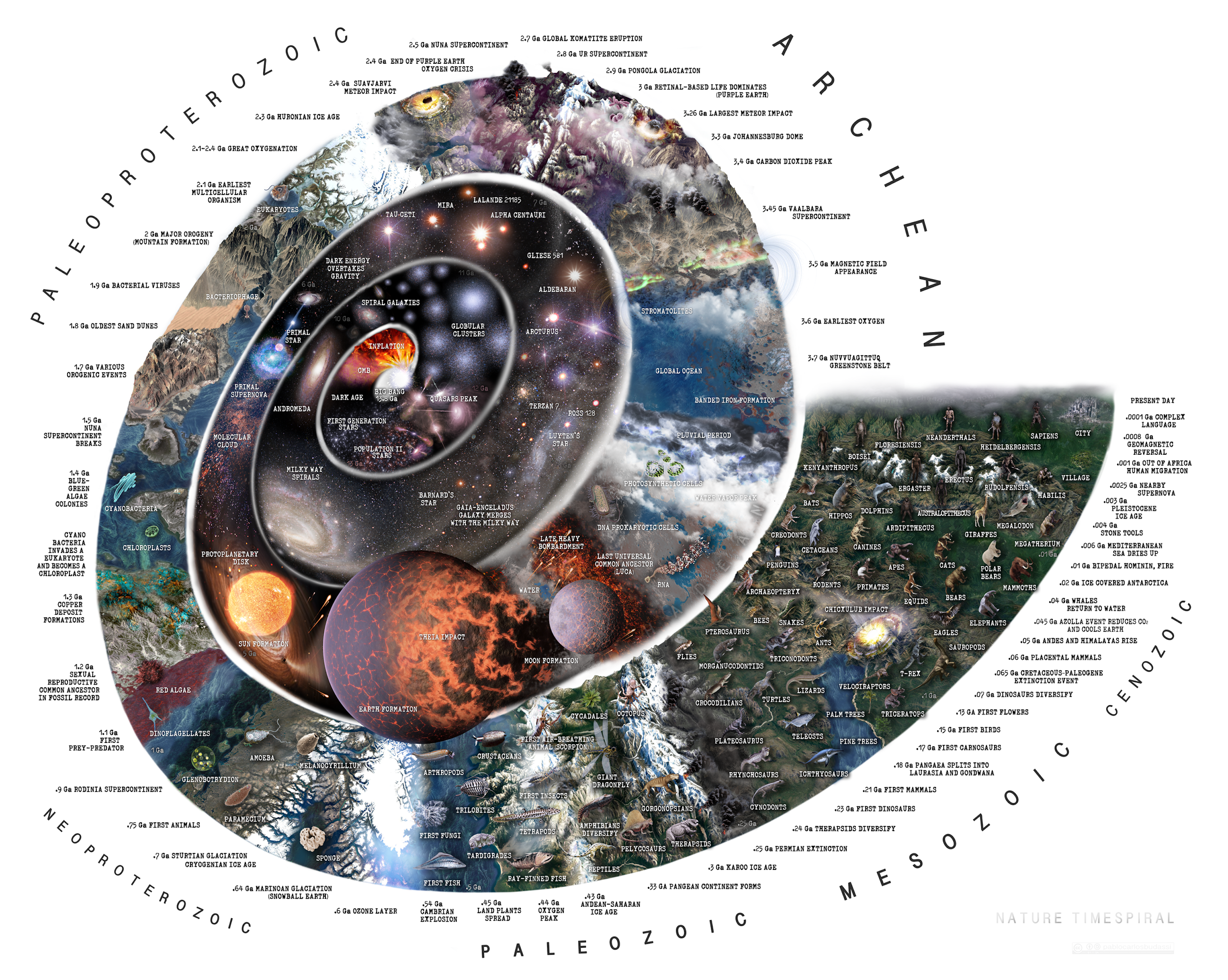
Fig 4. Nature Timespiral
“The history of nature from the Big Bang to the present day shown graphically in a spiral with notable events annotated. Every billion years (Ga) is represented by each 90-degree stretch of the spiral, starting with the Big Bang. The last 500 million years are represented in a 90-degree stretch for more detail on our recent history. Some of the events depicted are the emergence of cosmic structures, the emergence of the solar system, the Earth and the Moon, important geological events, the emergence and evolution of living beings, the evolution of hominid species and important events in human evolution.” Source: http://www.pablocarlosbudassi.com/2021/02/nature-timespiral.html (with further editing by Budassi). Credit: Nature Timespiral by Pablo Carlos Budassi, 2021 © Pablo Carlos Budassi. Explication available online: https://www.youtube.com/watch?v=_Mpik2zt5eg.
Le Guin’s Earthsea
Whereas Tharp abstracts with pencils and paints to make beautiful geographic ocean maps, and Budassi abstracts especially with countless meticulously-placed photographs to render our entire universe, in Ursula Le Guin’s Earthsea Map the cartographic abstraction of imaginative possibilities reaches a kind of apotheosis. The creative and well-received Earthsea fantasy series literally and metaphorically started with a map (Fig. 5), drawn in Le Guin’s own hand. She explains:
I had written a couple of short stories, very light short stories that took place on these islands where there were wizards and dragons. And when I sort of began thinking about a book, these islands grew in, just boom, it sort of, this is a whole archipelago of islands, and now I draw the map. And so the first thing I did for the book was the map. And I’ve always used that map all six books. (Simon & Schuster Books, 2012).
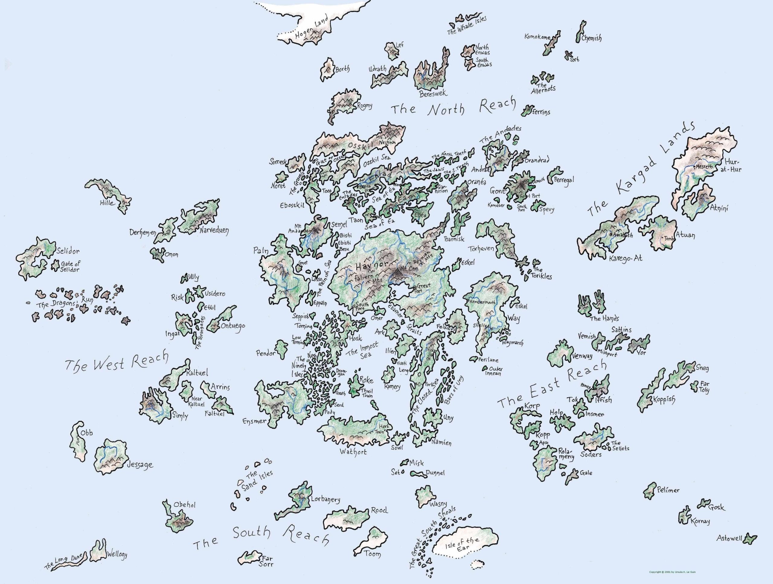
Fig 5. Earthsea Map
Here, Le Guin’s map of various Earthsea archipelagos. Maps help authors construct new worlds, and even open up these worlds to the reader. Recall J. R. R. Tolkien’s maps of Middle Earth from The Lord of the Rings; Robert Louis Stevenson’s map of Treasure Island; Pauline Bayne’s maps and illustrations of Narnia (and even of Middle Earth – Fig. 6); or R2-D2’s and BB-8’s complementary holographic maps from Star Wars: The Force Awakens. Or consider the many maps of Frank Herbert’s Dune (i.e., Arrakis), or Kim Stanley Robinson’s Mars, drawn by aficionados. Imaginative maps help us navigate the newly created worlds—not to say universes—of science fiction and fantasy literature. Credit: Maps of Earthsea by Ursula K. Le Guin and Pavle Učakar. © Ursula K. Le Guin Literary Trust. Work is licensed under a CC BY-NC-ND.
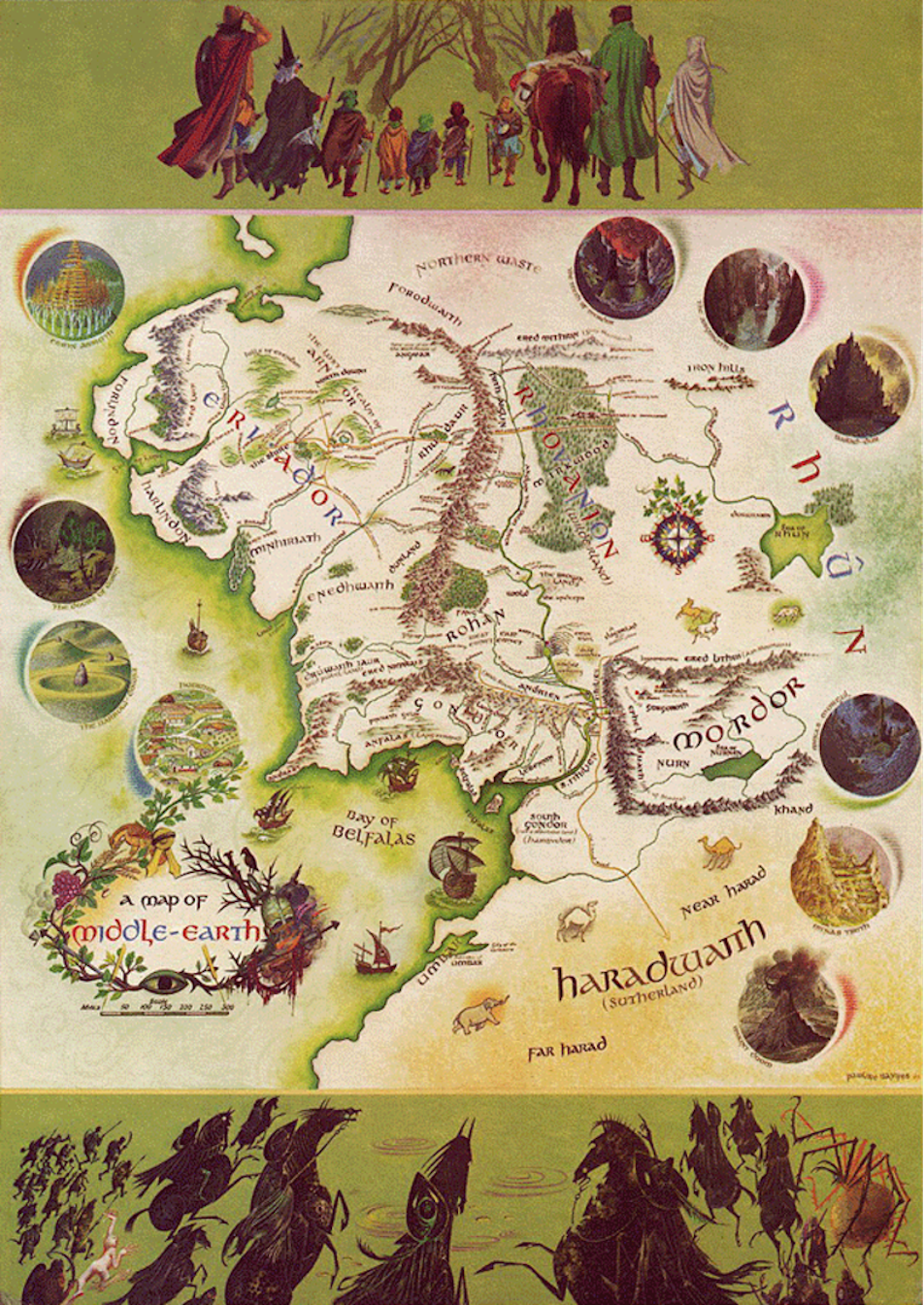
Fig. 6. A Map of Middle-Earth
“[Tolkien] once said: ‘If you’re going to have a complicated story you must work to a map; otherwise you’ll never make a map of it afterwards.’” (Carpenter 2000, p. 198) Credit: A Map of Middle-Earth (1969) painted by Pauline Baynes. Design by J. R. R. Tolkien, C. R. Tolkien, Pauline Baynes © George Allen & Unwin, Ltd., 1970.
What Do We Want?
We live in vulnerable times. In fact, in some ways, we now occupy something akin to the position of the child—we require, or perhaps just want, care and protection. Yet, our position can also be a source of power. It can offer us access to a more engaged imagination, the kind of rich and sincere imagination that often only a child is able to (or perhaps allowed to) express. Given the long reach of Homo sapiens—anthropogenic climate change, biodiversity and plastic crises, and neoliberal economic structures and extractivism furthering inequality—let us welcome our new vulnerability. It gives us an opportunity to question our assumptions, perceive what is “there” from new perspectives, and recreate our world in more imaginative, and I hope, more sustainable, manners. Art and fiction can mobilize maps to reimagine the status quo. It seems necessary and high time to do so.
Acknowledgments
Gratitude to THI for the opportunity to develop and write this piece; to the Office of the Dean, Humanities Division, UCSC for support; to Laura Laine for helping secure permissions for the figures; and to Aaron Aruck, Pablo Carlos Budassi, Molly Gage, Finn Bannergaard Johansen, and Marie Raffn for critical feedback.
References and Further Reading
Barnes, S. 2021. Illuminating Infographic Visualizes Existence as an Intricate Winding “Time Spiral.” My Modern Met Available Online: https://mymodernmet.com/pablo-carlos-budassi-nature-timespiral/.
Brotton, J. 2012. A History of the World in Twelve Maps. London: Allen Lane.
Budassi, P.C. 2022. “My Experience with Abstraction and Conceptualism.” Presentation for “Latin American Thought” Course, History of Consciousness 136, taught by R.G. Winther, University of California, Santa Cruz.
Carpenter, H. 2000. J.R.R. Tolkien: A Biography. Boston: Houghton Mifflin Co. (Originally published in 1977 by George Allen & Unwin, Ltd.)
Edney, M.H. 2019. Cartography: The Ideal and Its History. Chicago, IL: University of Chicago Press.
Felt, H. 2012. Soundings: The Story of the Remarkable Woman Who Mapped the Ocean Floor. (Kindle edition.) New York: Henry Holt.
Heezen, B., Tharp, M., Ewing, M. 1959. The Floors of the Oceans. I. The North Atlantic. Text to accompany the physiographic diagram of the North Atlantic. Special paper 65. New York: The Geological Society of America.
Simon & Schuster Books. 2012. “Ursula Le Guin and the Map of Earthsea.” Video, 49 seconds. https://www.youtube.com/watch?v=BGHbYByBnZ4.
Tharp, M. 1997. “Session IV” Oral Histories with Marie Tharp. Interview by Tanya Levin. Niels Bohr Library & Archives, American Institute of Physics. Available online: https://www.aip.org/history-programs/niels-bohr-library/oral-histories/22896-4.
Tharp, M. 1999. Connect the Dots: Mapping the Seafloor and Discovering the Mid-Ocean Ridge. In L. Lippsett (ed.), Lamont-Doherty Earth Observatory: Twelve Perspectives on the First Fifty Years, 1949-1999. Palisades, NY: Lamont-Doherty Earth Observatory of Columbia University. Available online: https://news.climate.columbia.edu/2020/07/24/marie-tharp-connecting-dots/.
Winther, R.G. 2019. “Mapping the Deep Blue Oceans,” The Philosophy of GIS (T. Tambassi, ed.), Springer, pp. 99-123. Available online: https://www.academia.edu/37794550/Mapping_the_Deep_Blue_Oceans.
Winther, R.G. 2020. When Maps Become the World. Chicago, IL: University of Chicago Press.
Winther, R.G. 2021. “Richard C. Lewontin as Master Dialectician (Rest in Power, Dick),” Science for the People, Lewontin Memorial Collection. Available online: https://magazine.scienceforthepeople.org/lewontin-special-issue/lewontin-as-master-dialectician.
Wood, D. 1992. The Power of Maps. (With J. Fels) New York: Guilford Press.
“Imaginative Maps” is part of The Humanities Institute’s 2022 Imagination Series. This series features contributions from a range of faculty and emeriti in the Humanities community at UC Santa Cruz – each of whom highlight connections between imagination and their work or consider the role of imagination in fashioning new worlds. Throughout Spring quarter, be sure to look for these amazing essays in our weekly newsletter!